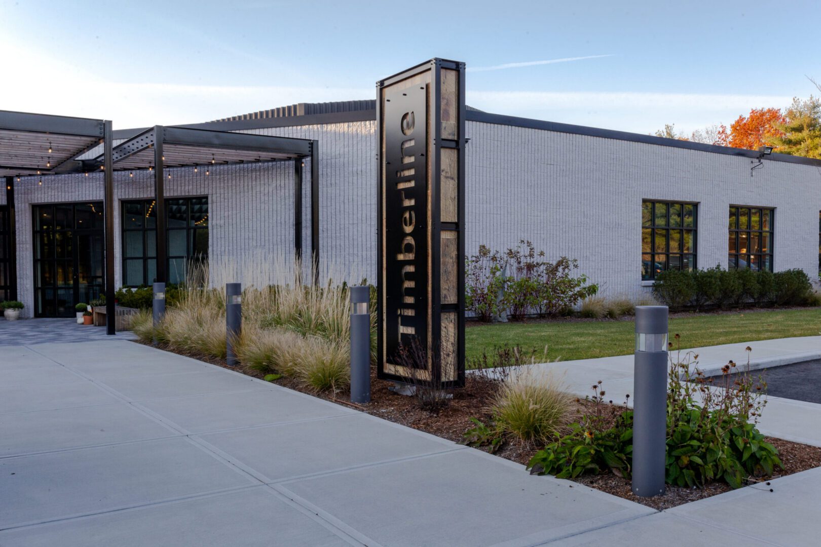
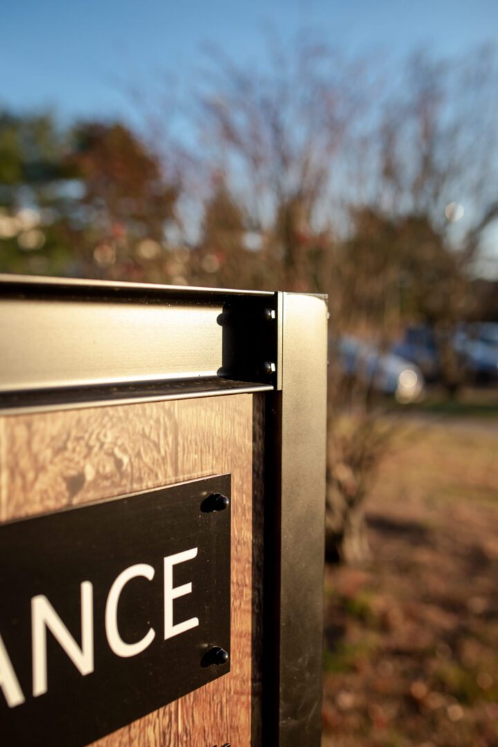
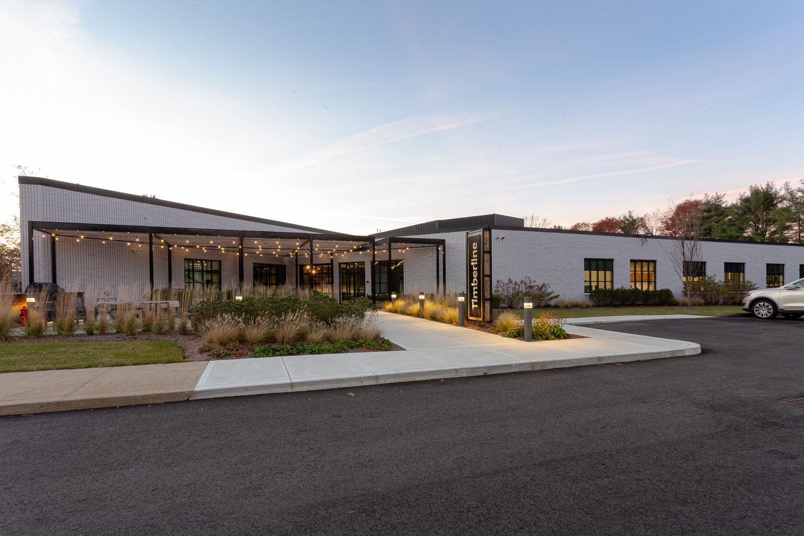
Timberline’s new headquarters presents a modern, restrained architectural language, and the signage was developed to support that character rather than compete with it. Across the site, the signs balance clarity with atmosphere, pairing dark brown metal with wood-toned panels to introduce texture, contrast, and a more grounded, hospitality-driven feel. We color matched the dark brown metal to the trim of the building, helping the signage feel integrated with the architecture and giving the full site a more cohesive appearance. The system feels organized and professional, but not cold.
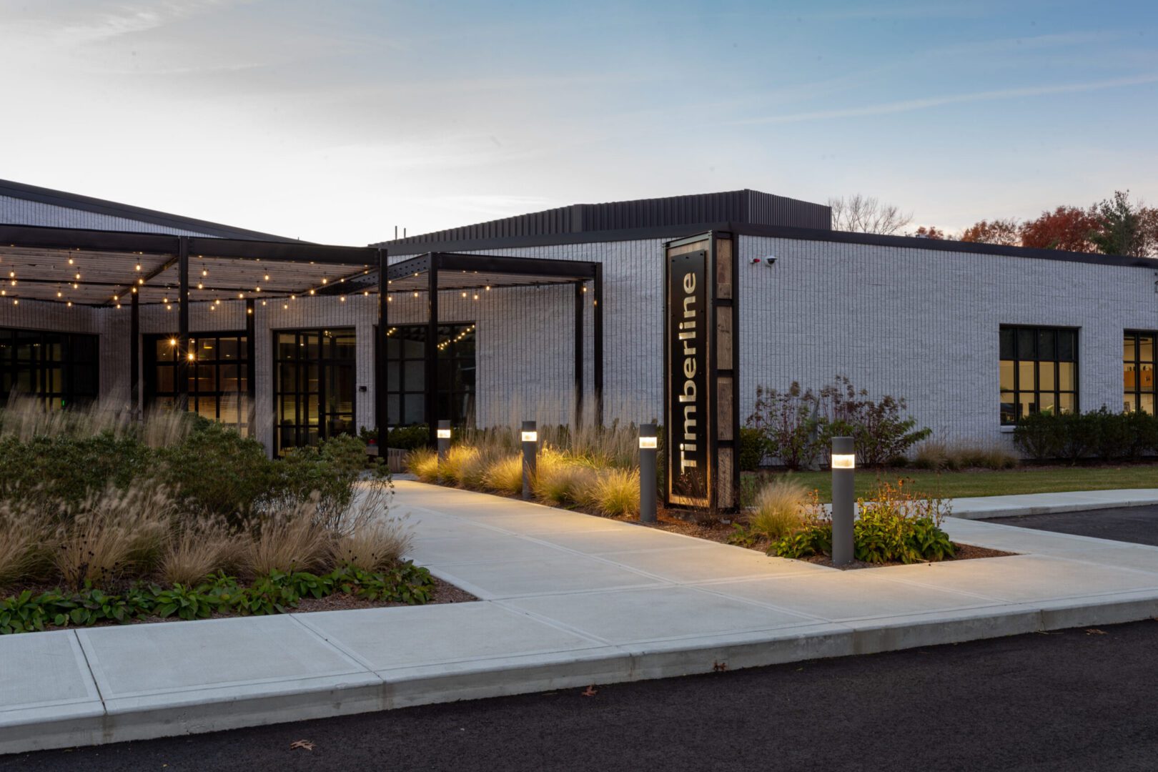
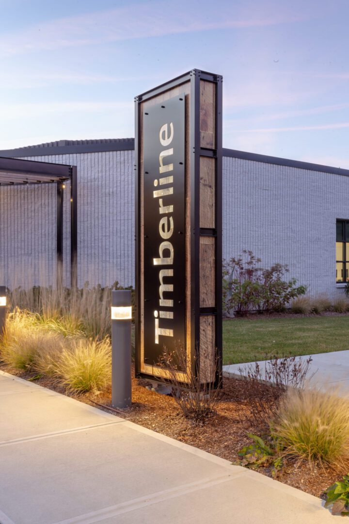
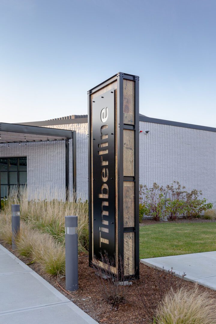
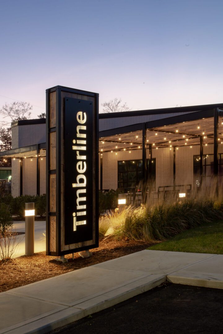
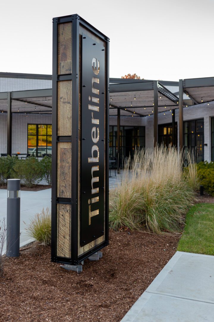
The monument sign is the defining element of the project. Its vertical form gives it strong presence at the entrance, while the combination of dark brown cut metal, wood beneath, and internal illumination creates depth and softness at the same time. During the day, the wood adds warmth and natural character, while the dark brown metal gives the sign a refined prominence. At dusk and at night, the illuminated letterforms bring the sign to life, with the light filtering through the cut metal in a way that feels polished, welcoming, and architectural rather than overly bright or commercial.
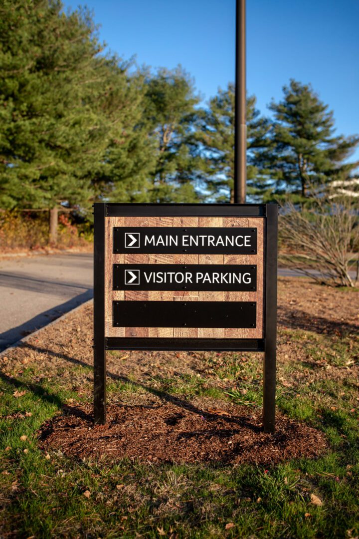
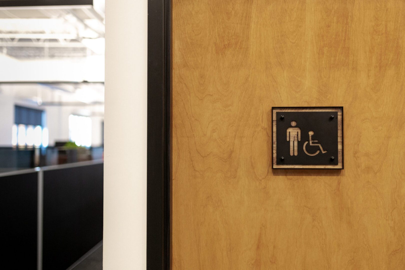
The supporting wayfinding elements carry those same material cues through the site. Directional signs use the same dark brown and wood palette, helping the campus feel visually consistent while keeping navigation simple and legible. Small details in the interior signage continue that language, extending the identity of the exterior system into the building in a subtle, cohesive way.
Together, these elements create a signage program that does more than identify the property. They help shape the experience of arrival, reinforce the quality of the new headquarters, and give Timberline a distinctive presence that feels both contemporary and enduring.