Before You Read
This guide is intentionally detailed.
Exterior signage is not a decorative decision. It is a capital investment that directly affects visibility, brand perception, durability, maintenance exposure, and long-term return on investment. The type of lettering selected, how it is scaled, how it is mounted, and how it is illuminated will influence how your building is perceived for years.
These are not minor choices. They are structural brand decisions.
We believe that if you are making a meaningful investment in your exterior identity, you deserve access to the same considerations we evaluate internally as designers and engineers. The sections that follow reflect the level of information we would want if we were responsible for approving a project of this scale.
If you are looking for a quick comparison, this may feel more in-depth than expected. If you are making a significant signage investment that will represent your organization for a decade or more, this is worth ten minutes of your time.
For guidance specific to your building or site conditions, you may contact us directly.
- Why Exterior Lettering Matters
- Visibility, Recognition & Brand Impact
- Exterior Lettering Systems Explained
- Mounting Methods & Structural Considerations
- Scale, Viewing Distance & Legibility
- Illumination & Electrical Reliability
- Climate Exposure & Long-Term Durability
- What Exterior Signage Really Costs
We believe that if you are making a meaningful investment in your exterior identity, you deserve access to the same considerations we evaluate internally as designers and engineers. The sections that follow reflect the level of information we would want if we were responsible for approving a project of this scale.
If you are looking for a quick comparison, this may feel more in-depth than expected. If you are making a significant signage investment that will represent your organization for a decade or more, this is worth ten minutes of your time.
For guidance specific to your building or site conditions, you may contact us directly.
Why Exterior Lettering Matters
It’s your business’s name. Say it proudly. In the built environment, that means being clear, legible, and present. Nothing does that better than channel or dimensional letters, which form the foundation of effective exterior identification for buildings across commercial, institutional, and civic settings, including the work we design and fabricate at Bailey Sign.
For any physical business, signage exists to do one essential thing: convert visibility into value. Every location carries exposure with it. People pass by, often repeatedly, building familiarity with places long before they ever become customers. Exterior lettering determines whether that exposure turns into recognition or simply disappears into the background, a distinction that separates buildings that register in memory from those that are merely passed.
This is why location has always carried such weight. Businesses pay a premium for the right address because of what it offers in return: traffic, visibility, and opportunity. But location alone does not deliver results. It creates potential. Signage is what captures that potential and turns it into something durable, anchoring the business within its physical context rather than leaving its presence implicit.
Clear exterior lettering ensures that the value embedded in a location is not wasted. It allows people to know who occupies a building, where a business is, and to remember it later. Without that clarity, a portion of what is paid for in rent, taxes, or ownership simply passes by unused, regardless of how strong the business itself may be. This principle applies across sign types, whether the solution is channel letters, monument signs, or other forms of exterior identification.
Clear exterior lettering ensures that the value embedded in a location is not wasted. It allows people to know who occupies a building, where a business is, and to remember it later. Without that clarity, a portion of what is paid for in rent, taxes, or ownership simply passes by unused, regardless of how strong the business itself may be. This principle applies across exterior sign types, whether the solution is channel letters, monument signs, or other forms of exterior identification (see Outdoor Signs)
Over time, this difference compounds. A business that is easy to identify becomes familiar. A business that is familiar feels established. And businesses that feel established are easier to trust. Exterior lettering is therefore not decoration, but infrastructure: the mechanism that allows a location’s visibility to accumulate into recognition, credibility, and long-term value.
Signage as long-term return on investment
Unlike most forms of advertising, signage does not operate on a schedule. It does not stop when a campaign ends or when a budget runs out. Once installed, it works continuously. Every day. Every night. For years. Exterior lettering functions as permanent visibility infrastructure rather than a time-bound marketing expense, which is why it is typically evaluated differently from media-driven advertising channels (see Exterior Signs overview)
That makes exterior lettering one of the most cost-effective brand investments a physical business can make. The cost is front-loaded, but the value is delivered over time. Each passing day adds impressions. Each repeated encounter reinforces recognition. The longer the sign remains in place and performs well, the lower the effective cost per impression becomes, particularly when compared to recurring digital or print advertising costs that reset with each new campaign.
This is particularly important for local and regional businesses. While digital advertising competes for attention moment by moment, signage benefits from routine exposure within the built environment. People see the same buildings again and again as they move through their community. Over time, they may stop consciously noticing the sign, but the name and location are retained. When the need arises, the business feels familiar, even if they have never interacted with it directly. Research into environmental familiarity and place-based recognition shows that repeated passive exposure strengthens recall and decision confidence, a principle discussed in SEGD’s Wayfinding and Placemaking: A Systems Approach, which examines how repeated exposure to environmental identifiers influences recognition and behavioral response over time.
That familiarity has measurable value. It shortens decision making. It reduces hesitation. It increases the likelihood that a business will be considered when someone finally needs what it offers. Over the lifespan of a well-designed exterior sign, these incremental advantages compound, turning consistent visibility into sustained brand equity rather than transient awareness.
Be seen before being searched
Many purchasing decisions begin long before a customer actively looks for a service. People build mental maps of their surroundings. They notice where things are. They remember what exists in their area. Often, when the moment comes to choose, the business that feels familiar is the one that gets the call.
This pattern of pre-attentive recognition and place-based recall is well documented in environmental psychology and wayfinding research, including work summarized in Wayfinding and Placemaking: A Systems Approach, published by the Society for Experiential Graphic Design, which examines how repeated exposure to environmental identifiers shapes recognition and decision confidence over time.
Exterior lettering plays a central role in this process. It allows a business to be known before it is needed. It plants the name in memory through repeated, low-effort exposure. When that exposure is clear and consistent, recognition becomes automatic.
This is especially important in an environment where digital search is crowded and competitive. Signage operates outside of that competition. It does not require ranking, bidding, or targeting. It simply exists, reinforcing presence over time.
In this way, signage complements digital efforts rather than replacing them. It ensures that when someone does search, the business name already feels known. That recognition influences behavior in subtle but meaningful ways.
Institutional credibility and trust
There is also a credibility component to signage that should not be underestimated. Clear, well-executed exterior lettering communicates stability and intent. It signals that a business is invested in its location and expects to be there, a signal that is processed quickly and often subconsciously by people moving through the built environment.
This is why established institutions place such importance on signage systems. Banks, hospitals, universities, and national retailers standardize their exterior identification for a reason. They understand that clarity makes environments easier to navigate and organizations easier to trust. Research and professional guidance in wayfinding and environmental graphics consistently show that legibility, consistency, and predictability reduce uncertainty and increase user confidence in complex environments. These principles are outlined in SEGD’s Wayfinding and Placemaking: A Systems Approach, which examines how clear identification systems support trust and orientation across healthcare, education, and other institutional settings. This same approach is reflected across the types of organizations we support (see our Industries Served)
That same principle applies at every scale. A business that is clearly identified feels more legitimate than one that blends into its surroundings. A building that confidently displays its name feels intentional. These impressions form quickly and quietly, without conscious effort, long before any evaluation of services or pricing occurs.
Poor or unclear signage introduces doubt. People wonder if they are in the right place. They hesitate. They second-guess. Even if the business itself is excellent, that uncertainty creates apprehension before any interaction takes place.
Good lettering, whether it is illuminated channel letters, brushed steel letters, or other dimensional systems, reassures without speaking. It tells people they are where they are supposed to be, and it signals the level of quality, permanence, and professionalism of the organization behind the name.
The value of repetition
One of the most powerful aspects of signage is repetition. Unlike advertisements that appear once or twice, exterior lettering is experienced repeatedly by the same people over long periods of time. Each pass reinforces memory. Each encounter strengthens association. This effect is well documented in behavioral research, beginning with psychologist Robert Zajonc’s work on the mere exposure effect, which demonstrated that repeated, passive exposure increases familiarity and preference even without conscious attention.
This repetition builds brand strength locally in a way few other investments can. Over time, the business name becomes linked to a physical place. People reference it by location. They use it as a landmark. The sign becomes part of how the area is understood. Contemporary marketing science describes this process as building mental availability, a concept developed and measured by the Ehrenberg-Bass Institute, which shows that brands are more likely to be chosen when they come to mind easily in buying situations.
That level of familiarity cannot be rushed or forced. It is built quietly through consistent visibility. When signage performs well, it allows that process to happen naturally. The result is not short term attention, but durable recognition that accumulates over time as the business becomes embedded in the everyday routines of its surrounding community.
Day and night presence
Visibility does not end when the sun goes down. In many environments, evening and nighttime exposure account for a significant portion of daily traffic. Commuters, diners, shoppers, patients, and visitors encounter businesses after dark just as often as they do during the day, particularly in mixed-use corridors and institutional settings where activity extends beyond standard business hours.
When signage disappears at night, brand presence disappears with it. The location remains, but the business name does not. That gap represents lost impressions and missed opportunities to reinforce recognition at moments when people are deciding where to go, where to stop, or where to return. From a visibility standpoint, this creates a measurable interruption in continuity.
Illuminated channel letters or externally lit dimensional letters close that gap by maintaining legibility under changing lighting conditions. Technical guidance on luminance, contrast ratios, and visual adaptation outlined in the IES Lighting Handbook explains why illuminated letterforms remain identifiable after dark while non-illuminated systems often recede into the background.
The value of this continuity is cumulative. Each evening exposure adds to the same pool of familiarity built during the day. Together, they strengthen the overall presence of the business in its environment, increasing total impressions over time without increasing rent, marketing spend, or operational effort.
Brand building through clarity, not noise
Effective signage is not about being quiet or loud. It is about being appropriate to the environment and the moment. In the built environment, brand strength is shaped less by expressiveness than by whether information can be perceived, processed, and understood without effort under real viewing conditions.
Clear lettering supports brand building by making the business easy to identify. It allows people to know who occupies a building without interpretation or decoding. Over time, that clarity becomes part of the brand itself. Research on visual perception and reading has shown that word recognition relies heavily on letterform clarity, spacing, and contrast, particularly at distance and under variable lighting, a principle documented in foundational work on legibility and visual performance See Legge, G. E., & Bigelow, C. A., 2011, Does print size matter for reading? A review of findings from vision science, Vision Research, for more detailed understanding.
This is why strong brands are often the easiest to find. They do not hide behind abstraction. They present their name clearly and consistently. They allow recognition to do the work rather than forcing interpretation.
Logos, colors, and architectural elements all contribute to brand identity, but lettering carries the burden of clarity. Words are processed quickly compared to symbols, especially at distance and under changing light conditions. When the business name is clear, everything else has room to support it rather than compensate for it.
The cost of invisibility
Poor signage rarely causes dramatic failure. Instead, it quietly taxes performance. People pass by without registering the business. They know something is there but cannot remember the name. They hesitate when trying to find the location. These small points of friction add up over time, introducing subtle but persistent barriers between a business and the people moving through its environment.
The cost of invisibility is not always obvious, but it is real. It shows up in missed calls, lower walk-in traffic, and weaker local recognition. It shows up when businesses have to work harder elsewhere to compensate for what their location should already be delivering. Research on consumer search behavior and environmental cues has shown that ease of identification significantly affects approach and choice, particularly in physical settings where decisions are made quickly and with limited information. See Bitner, M. J., 1992, Servicescapes: The impact of physical surroundings on customers and employees for a more detailed understanding.
Good signage does the opposite. It allows dividends to be paid on a business’s location over time. It makes the business easier to recognize, easier to find, and easier to remember, reducing uncertainty and allowing visibility to translate directly into familiarity and action.
What effective exterior lettering is, and what you are actually choosing
Once your signage goal is clear, the choice of signage begins to shape the outcome. What form should that lettering take? What kind of sign are you actually installing on the building? And what does each option realistically deliver over time.
This is where many businesses feel overwhelmed. The signage industry uses familiar terms, but those terms often hide important differences in performance, perception, and longevity. Two signs can look similar in a proposal and behave very differently once installed.
Effective lettering is not about choosing a category. It is about choosing a system that delivers clarity, presence, and consistency in a specific environment.
What follows is an overview of the most common exterior lettering and identification options, what they do well, where they fall short, and how they are typically used in practice.
Exterior Lettering as a System: Understanding the Available Forms
Exterior lettering is often discussed as a collection of styles. In practice, it functions as a system that mediates between a building, its surroundings, and the people moving through that environment. Before evaluating individual letter styles or finishes, it is useful to understand the functional categories that exterior lettering systems fall into and the roles they are designed to play. Research in environmental design and wayfinding consistently treats signage as a coordinated system rather than isolated elements, emphasizing how placement, form, and visibility work together to shape user understanding of space. See Arthur, P., & Passini, R., 2002, Wayfinding: People, Signs, and Architecture, New York, NY: McGraw-Hill to expose this subject in more depth.
These categories are not rankings. Each represents a different balance between visibility, architectural integration, and long-term performance. Understanding where a system sits within this framework clarifies which options are appropriate for a given site and which are likely to underperform, regardless of how well they are fabricated. Approaching exterior lettering through this systems lens helps align design decisions with how a building is encountered, used, and maintained over time.
Internally Illuminated Lettering Systems
(Primary visibility systems)
This category includes front-lit channel letters, combination-lit channel letters, and open-face channel letters, all of which are designed to serve as primary building identification where visibility is a dominant requirement.
Internally illuminated lettering systems are engineered to provide consistent legibility across the widest range of viewing conditions. By emitting light directly through or from within the letterform, these systems maintain clarity at distance, at speed, and in low-light environments. The illuminated letterform itself becomes the message, allowing the business name to remain readable under conditions where non-illuminated systems often lose definition.
These systems are most effective where recognition must occur quickly or repeatedly, such as along roadways, across parking areas, or within visually complex commercial corridors. Because the letterform carries its own light source, performance is less dependent on ambient lighting conditions, façade illumination, or external fixtures, making results more predictable across seasons and time of day.
The primary tradeoff is architectural restraint. Internally illuminated systems tend to read as signals rather than as extensions of the building fabric. When that role aligns with the environment and the function of the site, they perform exceptionally well. When it does not, they can feel visually assertive relative to more architecturally integrated lettering systems.
Reflected-Light Lettering Systems
(Architectural integration systems)
This category is defined primarily by halo-lit (reverse-lit) channel letters.
Reflected-light lettering systems rely on light interacting with the building surface rather than passing directly through the letter face. The letterform is defined by silhouette and edge glow, producing a softer, more restrained presence that integrates closely with the architecture.
These systems perform best at closer viewing distances and in environments where approach speed is low and lighting conditions are controlled. They are commonly used on professional buildings, campuses, and architecturally expressive façades where material continuity and proportion are emphasized.
The tradeoff is distance performance. Because legibility depends on contrast, placement, and reflected light, these systems are less forgiving when asked to function at speed or in visually noisy surroundings.
Non-Illuminated Dimensional Lettering
(Material expression systems)
This category includes metal letters, acrylic letters, wood or composite dimensional letters, and similar non-illuminated forms.
Non-illuminated dimensional lettering expresses identity through form, depth, and material rather than light. Shadows, highlights, and surface contrast define the letterform, allowing the signage to read as an architectural element rather than an applied graphic.
These systems perform best in close-range environments where viewers encounter the building on foot or at low speed. They are frequently used at office entries, institutional buildings, historic districts, and locations where visual restraint and permanence are priorities.
Their performance in low-light conditions depends entirely on exterior lighting. When that lighting is deliberate and well maintained, dimensional letters can remain legible after dark. When it is inconsistent or incidental, visibility drops quickly.
Enclosed or Panel-Based Lettering Systems
(Constraint-driven systems)
This category includes cabinet signs, light-box signs, and cut-through letter panels.
Enclosed lettering systems are often selected in response to constraints rather than preference. Zoning limitations, existing sign bands, retrofit conditions, or multi-tenant requirements frequently dictate their use.
Performance varies widely depending on execution. Traditional cabinet signs emphasize uniform illumination over depth, while material-forward cut-through panels introduce greater architectural presence by allowing light to pass through solid materials rather than printed faces.
The tradeoff is reduced dimensionality and integration compared to individual letter systems. These solutions can perform reliably when constraints are acknowledged and addressed deliberately, but they are rarely interchangeable with true letter-based signage.
Reading the Menu Correctly
Each of these systems resolves visibility, integration, and longevity in a different way. Problems arise when a system designed for one role is asked to perform another—when architectural systems are expected to function as high-signal identifiers, or when signal-driven systems are imposed on façades that call for restraint.
Understanding the functional category clarifies the decision long before details such as finish, lighting color, or fabrication method are considered. When the system aligns with how the building is encountered and maintained, exterior lettering performs quietly and consistently over time.
That consistency is what allows recognition, familiarity, and trust to accumulate—often without drawing attention to the signage itself.
Channel letters as primary exterior identification
Channel letters are individual, three-dimensional letters with integrated illumination. They have become the standard for primary building identification across retail, healthcare, professional services, education, financial services, and banking, forming the backbone of many exterior signage systems (see Channel Letters overview within Outdoor Signs page. .
The reason is straightforward. Channel letters solve multiple problems at once. They provide depth and contrast during the day. They become even more remain after dark. They scale well to different building sizes. And they allow the business name to stand on its own without relying on external lighting or ideal conditions.
From a customer perspective, channel letters deliver reliability. The business name remains visible when lighting changes, when weather interferes, and when the surrounding environment becomes visually noisy.
Within channel letters, there are several common configurations, each with distinct characteristics.
Front-lit channel letters
Front-lit channel letters illuminate through the face of each letter, creating a clear, direct presentation of the business name. This is the most widely used channel letter style and, in many environments, the most effective from a legibility standpoint.
Because the illuminated face presents a solid, readable letterform, front-lit channel letters perform well at distance and at speed. They are commonly used in shopping centers, roadside buildings, healthcare facilities, and service-oriented businesses where quick recognition matters. The business name is visible, unambiguous, and easy to process without effort.
This approach maintains strong contrast under a wide range of lighting conditions. During the day, the dimensional form provides depth and shadow. At night, the illuminated face ensures the lettering remains readable without relying on external fixtures.
Front-lit channel letters also feel familiar to most people. They communicate clearly and predictably, which reduces friction for first-time visitors. When the goal is clarity, reliability, and consistent performance, this style continues to be the default choice.
Halo-lit or reverse-lit channel letters
Halo-lit channel letters illuminate behind the letter, casting light onto the surface of the building rather than through the face. The letterform itself appears darker, defined by a soft glow that outlines its shape.
This creates a restrained, architectural effect. Halo-lit letters are often chosen for professional offices, corporate headquarters, and environments where subtlety and refinement are valued. They tend to integrate closely with the building façade and feel more like part of the architecture than an applied element.
The tradeoff is legibility at distance. Because the face is not illuminated, halo-lit letters typically read best at closer viewing ranges and in lower ambient light conditions. They rely heavily on contrast between the letter and the building surface, as well as careful placement and scale.
When designed thoughtfully, halo-lit channel letters convey permanence and confidence. When used as the sole identifier in high-traffic or high-speed environments, however, they can underperform compared to face-lit alternatives. Understanding the viewing conditions is critical to using this style effectively.
Combination-lit channel letters
Combination-lit channel letters incorporate both face illumination and halo lighting. The letter face provides clarity, while the halo adds depth and visual presence against the building surface.
This approach is often selected when a business wants strong legibility without sacrificing architectural interest. The illuminated face ensures the name reads clearly at distance, while the halo softens the overall appearance and adds dimensionality.
Combination-lit channel letters require careful design and restraint. Too much brightness or contrast can create visual clutter, while a well-balanced execution can feel both polished and confident. These signs are typically used in environments where they will be viewed from multiple distances and angles.
When executed well, combination-lit letters offer flexibility. They bridge the gap between straightforward visibility and refined branding, making them a good fit for businesses that want to stand out without appearing overly aggressive.
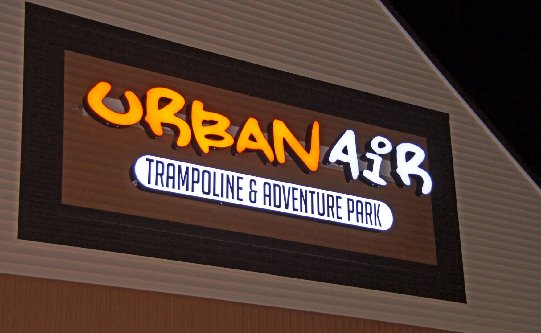
Open-face channel letters
Open-face channel letters remove the translucent face entirely and expose the illumination within the letter. Instead of glowing through a panel, the light source itself becomes part of the visual identity of the sign.
This style is chosen intentionally. Open-face channel letters feel expressive, energetic, and bold. They are often used when signage is meant to contribute to the character of a space rather than simply identify it. Restaurants, bars, entertainment venues, and urban storefronts frequently use this approach to create atmosphere as well as visibility.
Because the light source is visible, open-face letters attract attention differently than enclosed channel letters. They introduce texture and rhythm, especially at night, and can feel iconic when executed with care.
There are two common ways open-face channel letters are illuminated, each producing a distinct effect.
Individual bulb illumination uses exposed bulbs mounted within the letter. This approach is associated with classic marquee and theater signage. The individual points of light create a lively, almost animated appearance that feels warm and intentional. It works particularly well when personality and spectacle are part of the brand experience.
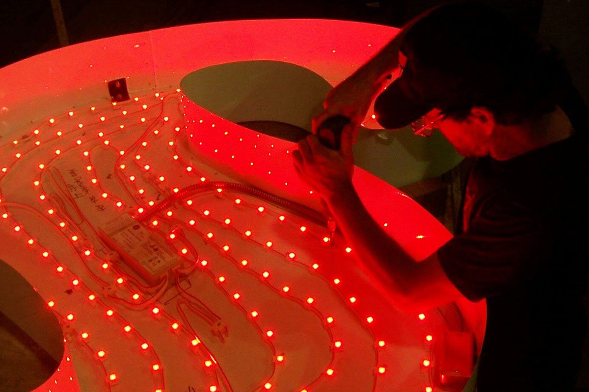
LED or neon-style strip illumination uses continuous light sources that trace the interior of the letter. This produces a smoother, more uniform glow while retaining the openness of the design. Neon-style LED systems allow for consistent brightness, smoother curves, and greater flexibility in color choice, often with lower maintenance requirements.
Open-face channel letters are rarely subtle, and that is often the goal. Like all signage, they must still remain readable and appropriate to their environment. When spectacle supports clarity and brand identity, this style can be highly effective.
Premium lighting technology
Advances in lighting technology have expanded what channel lettering can do, without changing its fundamental role as clear exterior identification. Modern systems allow far more control over how a sign presents itself across different conditions and moments, while maintaining legibility and consistency as the baseline. This shift reflects broader advances in solid-state lighting and digital control systems that emphasize adaptability rather than static output.
Contemporary channel letters can be fabricated with tunable lighting systems that allow controlled color changes when desired. This opens up opportunities for seasonal alignment, special events, or subtle brand evolutions over time without replacing the sign itself. Instead of being locked into a single static appearance for the life of the installation, the lettering can adapt while preserving its core form. This is supported by research from the Illuminating Engineering Society showing that color-tunable LED systems can shift spectrum without hurting legibility, as long as luminance and contrast are properly maintained
Lighting control also makes sequencing possible. Letters can be programmed to illuminate in a timed order, allowing the business name to reveal itself one letter at a time. The effect is simple but effective. Motion draws the eye naturally, especially in peripheral vision, and research in visual perception, as outlined in Vision Science: Photons to Phenomenology, shows that controlled temporal contrast can increase noticeability without requiring higher brightness levels or larger sign area.
Modern systems also allow precise control over brightness and output. Lettering can be tuned to perform consistently under different ambient conditions, from bright summer evenings to dark winter afternoons. This capability has become increasingly important in jurisdictions such as Maine, where updated lighting and lighted sign standards emphasize glare reduction, curfews, and adaptive output controls—making programmable signage systems better aligned with current and future compliance expectations (see Maine’s recent lighting and lighted sign standards ).
What these technologies offer is flexibility layered on top of clarity. The letterforms remain the primary communicator. The lighting simply becomes more responsive. When implemented as part of the overall system, these capabilities extend the usefulness of the sign and allow it to remain relevant over a longer span of time.
At their best, modern lighting options do not change what channel letters are meant to do. They make that function more adaptable, more durable, and more effective in real-world conditions.
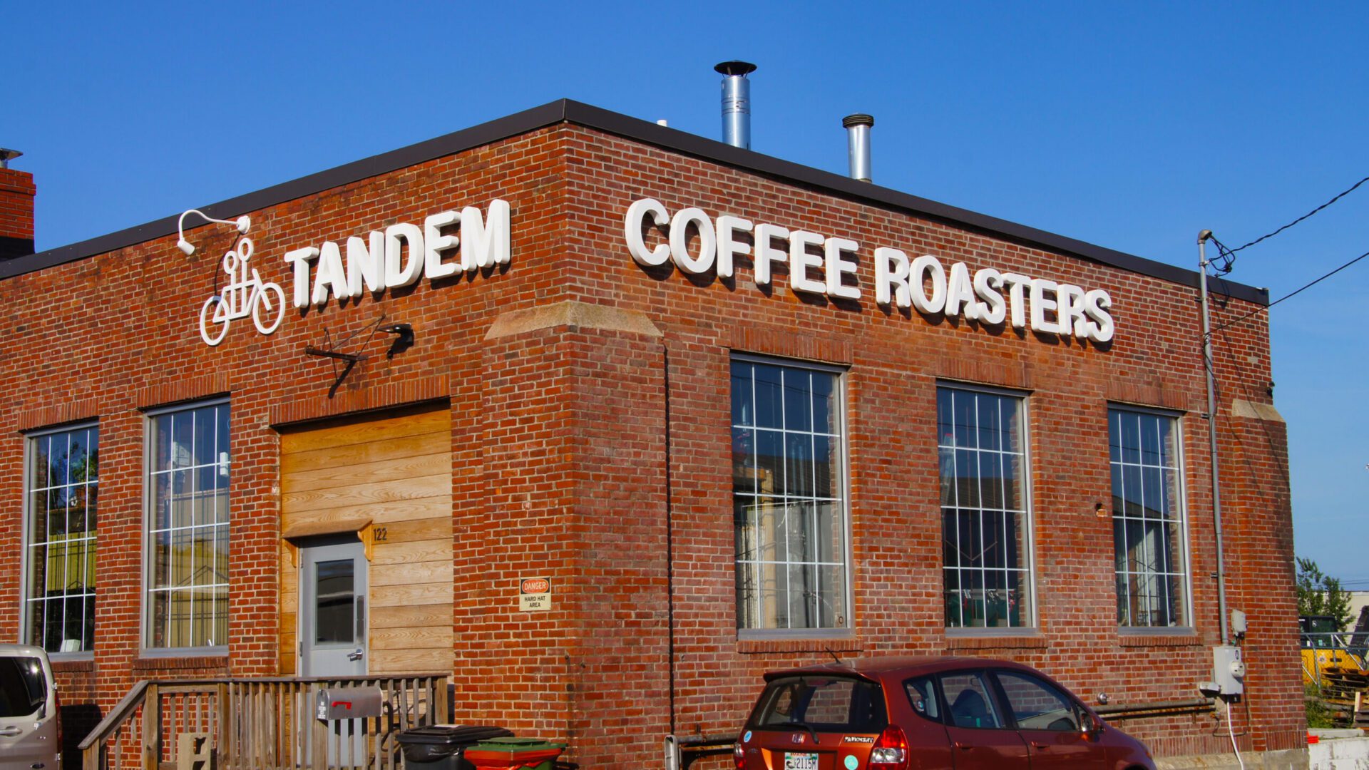
Dimensional letters
Dimensional letters are three dimensional letterforms that do not contain internal illumination. Rather than relying on light to define their shape, they rely on form, material, contrast, and placement. When designed and applied thoughtfully, dimensional letters feel less like signage and more like part of the building itself, functioning as architectural elements rather than applied graphics (see Dimensional Letters overview: https://www.baileysign.com/outdoor-signs#dimensional-letters).
This approach is often chosen when a business wants its identity to feel architectural rather than graphic. Dimensional letters can convey permanence, confidence, and restraint in a way illuminated signage sometimes cannot. They are commonly fabricated from metal, acrylic, composite materials, or wood, and finished to complement the surrounding façade in scale, color, and texture.
Material choice plays a significant role in how dimensional letters are perceived. Metal letters often communicate durability and professionalism. Acrylic letters can feel precise and contemporary. Wood or faux wood finishes introduce warmth and craft. These choices are not aesthetic alone. They shape how the business is perceived before anyone enters the space and influence whether the signage feels temporary or enduring.
Pro Tip
When choosing between acrylic and polycarbonate letter faces, durability comes with a trade-off. Polycarbonate offers superior impact resistance and is often selected for vandal-prone environments, but it relies on a surface-applied UV coating and typically fades or yellows more quickly in prolonged sun exposure. Acrylic incorporates UV protection throughout the material itself, allowing it to maintain color and clarity far longer when exposed to sunlight. The decision is ultimately a balance between impact resistance and long-term appearance.
Dimensional letters perform especially well in close range environments. Office buildings, institutional entrances, corporate headquarters, and architectural features often benefit from signage that is experienced on foot rather than at speed. In these contexts, the sign is read slowly and deliberately. The depth of the letters, the quality of the finish, and the relationship to the building surface all matter more than brightness or animation.
Because dimensional letters are not internally illuminated, they depend on ambient conditions to remain visible. During the day, shadows and highlights created by the letter depth add contrast and legibility. At night, visibility relies on surrounding light sources, whether from building mounted fixtures, site lighting, or nearby illumination.
This reliance on external lighting introduces both an opportunity and a limitation. When the lighting environment is controlled and intentional, dimensional letters can remain readable and visually compelling after dark. When lighting is inconsistent or insufficient, presence drops off quickly. For businesses that rely heavily on nighttime visibility, this gap can reduce the total number of impressions the location delivers over time.
That limitation does not make dimensional letters inferior. It makes them situational.
In many cases, dimensional letters are most effective as part of a broader signage system. They may serve as the primary identifier at an entry point, supported by illuminated lettering elsewhere on the building. They may reinforce a brand in close proximity while channel letters handle long range visibility. Used this way, dimensional letters add architectural weight and refinement without being asked to do work they are not suited for.
There are also environments where dimensional letters are the right primary solution. Historic districts, high end commercial architecture, corporate campuses, and institutional settings often prioritize integration over illumination. In these contexts, a restrained, well executed dimensional sign can communicate stability and confidence more effectively than a brighter alternative.
What matters is alignment. Dimensional letters work best when their role matches the viewing conditions, lighting environment, and brand intent. When they are chosen deliberately and designed as architectural elements, they do not feel like a compromise. They feel intentional.
Like all exterior lettering, dimensional letters must still meet fundamental requirements. They must be proportioned correctly. They must be legible against the building surface. They must be fabricated to withstand weather and time. When those conditions are met, dimensional letters deliver a quiet but durable form of presence that strengthens the overall identity of the building.
Dimensional letters can also be intentionally paired with exterior light sources to extend their presence after dark. Wall mounted gooseneck fixtures, recessed architectural lighting, canopy lighting, and site lighting are commonly used to wash light across the letterforms. When done well, this creates shadow, depth, and contrast rather than brightness. The letters remain readable while preserving their architectural character.
This approach produces a different effect than internal illumination. Instead of glowing, the letters feel grounded and material. Light reveals their form rather than defining it. In environments where subtlety and integration matter, externally lit dimensional letters can feel more deliberate and composed than fully illuminated signage.
The effectiveness of this strategy depends on consistency. The lighting must be aligned, maintained, and scaled appropriately to the lettering. When exterior lighting is treated as part of the signage system rather than an afterthought, dimensional letters can maintain a strong nighttime presence without compromising their intended aesthetic.
Cabinet signs and enclosed sign systems (light-box signs)
Cabinet signs, often referred to as light-box signs, enclose lettering or graphics within a single illuminated housing. Rather than illuminating individual letters, the entire sign face or panel is lit as one unit, with graphics or letterforms applied to or cut into the surface.
These systems remain common in many commercial environments, particularly where existing infrastructure, zoning constraints, or legacy sign bands dictate the format. Shopping centers, retrofits, and multi-tenant properties often rely on light-box signs because they fit within predefined conditions and allow for relatively fast installation.
From a functional standpoint, light-box signs can be highly visible. They provide consistent illumination and can accommodate large-scale graphics or text. When visibility alone is the objective, they can perform reliably, especially in environments with competing visual noise.
From a brand and architectural perspective, however, cabinet signs introduce tradeoffs. Because the sign is enclosed, letter edges are often softened by the illuminated panel. Depth is reduced, and the sign tends to read as a single object rather than as lettering integrated with the building. At close range, this can make the sign feel flatter and less intentional than dimensional or channel letter alternatives.
That said, not all enclosed systems are created equal.
Cut-through letter panels and material-forward light-box designs
A more refined variation of the light-box sign uses a solid panel of material such as steel, aluminum, or composite, with the letterforms cut directly from a single piece. Illumination is placed behind the panel, allowing light to pass through the cut letters rather than through a printed or applied face.
This approach shifts the visual emphasis from the box to the material itself. The panel becomes architectural, and the lettering feels carved rather than applied. When executed well, this type of sign can feel deliberate, crafted, and materially honest in a way traditional cabinets often do not.
The effect is subtle but powerful. Instead of glowing broadly, light is controlled and precise. The letter edges remain crisp. The contrast between the solid material and the illuminated cutouts creates depth and shadow, even though the sign remains technically enclosed.
These systems are often used in higher-end commercial interiors, hospitality environments, and architectural façades where the goal is to balance illumination with material expression. They occupy a middle ground between traditional light-box signs and fully dimensional lettering.
Logo-centric signage and branded marks
Logos are an essential part of brand identity, but they function differently than lettering.
Symbols require recognition to be effective. Words do not.
In exterior environments, particularly when viewed at distance or speed, the business name is processed faster than an icon. This makes lettering the primary communication tool, especially for first-time viewers.
Logos work best when they support a clearly readable name. They add recognition and character once the name is already familiar. When used alone, they often introduce ambiguity.
Many businesses overestimate the power of their logo in exterior signage. Even strong brands rely on clear lettering in most environments. The logo reinforces the message. It rarely replaces it
Mounting methods and how they shape perception
How lettering is mounted to a building affects more than attachment. It influences how the sign reads visually, how light behaves around it, and how durable the installation is over time.
Direct mounting, where letters are fastened flush to the building surface, tends to feel straightforward and utilitarian. It minimizes visual separation between the sign and the façade, which can work well on clean surfaces or when a low-profile appearance is preferred. From a durability standpoint, fewer components can mean fewer points of failure, but it also places more responsibility on the building surface itself to remain stable and watertight.
Stand-off mounting introduces space between the letters and the building. Letters are supported by standoffs or rails that lift them slightly off the surface. Visually, this creates depth and shadow, which can make lettering feel more intentional and architectural. Even without illumination, stand-offs help separate the letters from complex backgrounds and improve legibility.
Rail-mounted systems and visual discipline
Rail-mounted systems use a continuous or segmented rail to support multiple letters. This approach is often chosen when minimizing wall penetrations is important or when the building surface does not allow for precise individual mounting.
From a perception standpoint, rail-mounted lettering can feel more orderly and deliberate when executed cleanly. The rail introduces a subtle horizontal alignment that can reinforce balance across the façade. When handled poorly, however, rails can become visually dominant and detract from the lettering itself.
Durability is often improved with rail systems, particularly on masonry or irregular surfaces. Loads are distributed more evenly, penetrations are reduced, and future service can be simplified. The key is proportion. The rail should support the letters without becoming the focus.
Stand-offs, lighting behavior, and depth
Stand-offs play a significant role in how light interacts with the building. For halo-lit channel letters, stand-off depth directly affects the quality of the glow. Too little space can flatten the effect. Too much can cause uneven light or visual distraction.
Even for non-illuminated dimensional letters, stand-offs create shadow lines that add contrast throughout the day. In angled sunlight or low winter light, these shadows can dramatically improve legibility and presence without adding brightness.
From a durability perspective, stand-offs also help protect the building surface. They allow air and moisture to move behind the letters rather than trapping it against the façade, which can reduce long-term wear when properly designed and sealed.
Roof-mounted and elevated signage considerations
Roof-mountedsignage occupies a different category altogether. These signs are typically used when building height, setbacks, or surrounding obstructions limit wall-mounted visibility. They are designed to be seen from greater distances and often serve as landmark identifiers rather than close-range signage.
Because of their exposure, roof-mounted signs must account for wind loads, structural reinforcement, and weather more aggressively than wall-mounted lettering. Perception-wise, they carry more presence and authority, but also greater responsibility. Poorly executed roof signage can feel intrusive or out of scale, while well-integrated systems can define a building’s identity within its surroundings.
Roof-mounted options are not always appropriate, but when visibility demands outweigh architectural constraints, they can provide clarity that wall-mounted signage cannot.
Pro Tip: Don’t invalidate your roof’s warranty. Improperly coordinated roof penetrations for signage can void a building’s roof warranty. To prevent this, penetrations and footers are usually installed by the roofing contractor, using anchor details supplied by the signage provider. On new construction, this coordination should occur before the roof is installed.
Why mounting decisions matter
Mounting is not a secondary detail. It shapes how the sign is perceived, how it performs in changing light, and how well it survives over time. Two signs with identical letterforms can feel completely different based solely on how they are mounted.
When mounting decisions align with the building, the environment, and the intended viewing conditions, the sign feels intentional rather than applied. That intention is often what separates signage that quietly works for years from signage that feels temporary or compromised.
HOW LETTERING DELIVERS VALUE IN THE REAL WORLD
Choosing the right type of lettering is only the beginning. What determines whether a sign continues to create value year after year is how that lettering is translated into the real world. This is where execution matters. Not in a dramatic way, but in a quiet, cumulative one that shapes how consistently a sign performs over its lifespan.
Most signage does not fail all at once. It underperforms gradually. Visibility softens. Components age. Small compromises compound. Over time, the sign stops working as hard as it once did, even though it still technically exists. These changes often go unnoticed until recognition drops, maintenance costs rise, or replacement becomes unavoidable.
In New England, that process happens faster when it is not anticipated from the start.
In Maine, New Hampshire, and Massachusetts, exterior signage lives in one of the most demanding operating environments in the country. Snow loads, ice, wind, coastal moisture, salt exposure, and constant freeze thaw cycles place ongoing stress on every part of a sign. Materials expand and contract. Water finds paths. Electrical systems are tested repeatedly. Climate data from the National Oceanic and Atmospheric Administration show that this region experiences some of the highest annual freeze thaw variability in the United States, a factor known to accelerate material fatigue and seal failure in exterior assemblies.
Effective signage is designed for those realities from the beginning, not as an afterthought or a later upgrade, but as a baseline assumption. Engineering guidance for exterior structures consistently reinforces this approach, emphasizing that durability in cold and coastal climates depends on material selection, fastening methods, drainage paths, and environmental protection being integrated early in the design process rather than addressed reactively (as outlined in ASCE 7-16 design standards for structural loads and environmental conditions).
At Bailey, most of what determines long term performance is addressed through the design and engineering process before fabrication ever begins. The goal is not to burden clients with technical decisions. It is to ensure that the decisions being made quietly support durability, visibility, and consistency over time, allowing the sign to continue delivering value in the specific conditions it will actually face.
Illumination and Electrical Reliability
When signage is illuminated, lighting becomes part of the structure, not an accessory. Even illumination, controlled output, and protected electrical components determine whether a sign remains readable over time or gradually becomes uneven, distracting, or unreliable. Performance depends not only on brightness, but on how consistently light is delivered across the letterforms under real operating conditions.
Access matters. Drainage matters. Electrical components must be serviceable without dismantling the sign or damaging the building envelope. In cold-weather regions, electrical planning becomes even more critical. Power supplies, connections, wiring methods, and internal components must be selected and located with temperature extremes, moisture intrusion, and condensation cycles in mind. Research summarized by the Federal Highway Administration shows that lighting systems exposed to repeated freeze-thaw cycles and moisture intrusion experience accelerated failure when environmental protection and serviceability are not designed in from the outset (Federal Highway Administration, 2009, Traffic Control Devices Handbook; https://ops.fhwa.dot.gov/publications/fhwahop09006).
Industry guidance similarly emphasizes that uniform illumination, proper drainage, and accessible electrical design are essential to maintaining legibility and minimizing long-term maintenance costs (International Sign Association, 2018, Sign Installation and Maintenance Guidelines; https://www.signs.org/resources). Lighting standards further caution that inconsistent output and component degradation can reduce visibility and introduce glare over time if luminaires and power systems are not matched to environmental conditions (Illuminating Engineering Society, 2020, The Lighting Handbook, 10th ed.; https://www.ies.org/lighting-handbook/).
These considerations are built into Bailey’s design process so performance remains consistent across seasons, not just at installation. Through an integrated approach to engineering, detailing, and environmental planning developed as part of our signage design services (Bailey Sign – Design Process; https://www.baileysign.com/design), durability, serviceability, and electrical reliability are addressed before fabrication ever begins. The goal is not short-term success, but reliable identification that continues to function as intended through repeated winters, rather than gradual decline driven by avoidable environmental stress.
Scale, Proportion, and How a Sign Is Actually Seen
One of the most common reasons exterior signage underperforms is scale. Letters that feel appropriate on a drawing or rendering can appear surprisingly small, flat, or ineffective once installed on a building.
Effective scale is not about taste. It is about how a sign is encountered in real life. Distance matters. Speed matters. Angle of approach matters. A sign meant to be read from a parking lot functions very differently from one read from a moving vehicle. A building facing a roadway has different demands than one tucked into a campus, courtyard, or pedestrian corridor.
These factors are rarely obvious when lettering is viewed in isolation. They emerge only when the building, its surroundings, and traffic patterns are considered together. That is why scale, spacing, and depth are evaluated as part of the overall environment—not just the lettering itself. When these elements are right, a sign reads easily and feels natural. When they are off, the sign works harder than it should and still delivers less.
Contrast and Background Conditions
A sign never exists on a blank canvas. It lives against a building surface, under changing daylight, weather, and seasonal conditions, and alongside other visual elements competing for attention. The effectiveness of exterior lettering is inseparable from the context in which it is seen.
Contrast is one of the most important, and most frequently underestimated, factors in exterior lettering performance. Color, finish, material, and illumination interact directly with the façade behind them, affecting how quickly and reliably letterforms are perceived. A letter that appears crisp against one surface can lose definition against another. A finish that performs well in direct sunlight can flatten under overcast skies or snow glare. These effects are not theoretical. Human factors and lighting research consistently show that legibility depends on luminance contrast, visual angle, and background complexity under real viewing conditions (as detailed in theIES Lighting Handbook, 10th Edition)
Good signage accounts for how a building appears at different times of day, across seasons, and under varying lighting conditions. Environmental graphic design guidance emphasizes that effective identification systems maintain contrast and legibility as ambient light levels, weather, and viewing distance change, rather than optimizing for a single ideal condition (as discussed in SEGD’s Wayfinding and Placemaking: A Systems Approach)
The goal is not maximum brightness or visual dominance. It is clarity that holds up as conditions change, allowing the lettering to remain readable, recognizable, and consistent in the real environments where it must perform.
How Big and How Bright Should Your Sign Be?
For most businesses, channel letters or dimensional letters serve as the primary building identifier. The goal is simple: customers should recognize your business early enough to react, whether they are driving past at speed or approaching from an angle. Recognition timing, not aesthetics, is the governing constraint.
Letter size is primarily driven by viewing distance and vehicle speed. As a practical rule of thumb, we often set minimum lettering size at roughly one inch of height for every 30 to 40 feet of viewing distance, then adjust based on contrast, angle, placement, and site conditions. That approach aligns with broader industry guidance showing that readability is shaped by the relationship between letter size, distance, and sign placement (see ISA’s design and placement guidance for effective signs). As speeds increase, drivers need more time to perceive, read, and process information, which means larger letters are often necessary to maintain adequate recognition time.
Transportation research reinforces this relationship. Studies summarized by the Federal Highway Administration’s Traffic Control Devices Handbook show that increased character height directly improves legibility distance and recognition time for drivers, particularly in complex roadside environments. Guidance from the Federal Highway Administration’s research on sign legibility and viewer response similarly emphasizes that letter height must scale with speed, viewing distance, and visual workload.
Brightness for channel letters is not about being as bright as possible. It is about providing sufficient luminance contrast between the letter and its background so the letterform is clearly defined. Excessive brightness can reduce legibility by introducing glare, halation, and edge washout, particularly at night (Illuminating Engineering Society, 2020, The Lighting Handbook). Independent research and industry standards recommend controlled luminance levels to reduce visual discomfort and light trespass while maintaining clarity (See U.S. Sign Council Foundation, 2019, On-Premise Sign Brightness Guide.
Viewing angle is often overlooked but critical. A sign viewed straight on can be smaller than one viewed at a sharp angle from a roadway. As the viewing angle increases, the effective width of each letter decreases, requiring additional letter height to maintain readability. FHWA visibility research shows that oblique viewing angles significantly reduce legibility distance unless compensated for through increased character size (FHWA, 2009).
Practical Planning Matrix
(Exterior Channel & Dimensional Letters)
Road Speed | Typical Viewing Distance | Recommended Minimum Letter Height | Viewing Angle Consideration | Illumination Guidance |
25 mph | 150–250 ft | 6–8 inches | Minimal increase if sign faces roadway | Moderate internal illumination; avoid glare |
35 mph | 250–350 ft | 8–10 inches | Add ~10–15% height if viewed at >30° angle | Even face illumination or soft halo lighting |
45 mph | 350–450 ft | 10–12 inches | Add ~15–25% height for angled approach | Brighter daytime output, dimmed at night |
55+ mph | 450–600+ ft | 12–18 inches | Larger increase needed for oblique views | Carefully controlled brightness; no over-lighting |
(Sizing based on International Sign Association legibility guidance and Federal Highway Administration visibility research; lighting principles informed by Illuminating Engineering Society, U.S. Sign Council Foundation, and AASHTO standards.)
Pro Tip: Use this matrix during planning board review. When letter size is tied to roadway speed and recognized legibility standards, scale becomes a visibility requirement rather than a preference, which often strengthens approval discussions.
Weather, drainage, and long-term survivability – Why EMCs Are Not Billboards
Water is one of the most common causes of signage failure, particularly in cold climates. Snow melt, ice buildup, wind driven rain, and condensation all find their way into poorly planned systems.
Proper drainage is essential. Internal layouts, weep paths, and sealing details must be intentional and sized appropriately. Materials and finishes must be selected for corrosion resistance and long term exposure. Fasteners and structural components must withstand repeated stress without loosening or deforming.
Survivability is not about overbuilding. It is about understanding how signs fail and designing to prevent those failures before they happen.
When done correctly, signage does not call attention to itself through maintenance issues or visual degradation. It simply continues to perform.
Fabrication, installation, and integration with the building
How letters are fabricated and installed affects everything that follows.
Material thickness, weld quality, fastening methods, and finish integrity all contribute to how well the sign ages. Installation methods must suit the building structure, whether masonry, metal panels, EIFS, or curtain wall systems. Penetrations must be sealed correctly. Loads must be distributed appropriately.
Just as important is how the sign integrates visually with the building. Raceway choices, standoffs, and mounting methods influence not only durability but perception. A sign that feels intentionally integrated reinforces confidence. A sign that feels applied or compromised quietly undermines it.
Consistency over time
The value of exterior lettering is cumulative. It is built through repetition. That only works if the sign performs consistently.
Flickering lights, uneven brightness, discoloration, or visible wear erode trust slowly but steadily. People may not articulate what feels off, but they register it.
Well executed signage fades into the background in the best possible way. It does its job every day without demanding attention. That quiet reliability is what allows familiarity and trust to build over time.
Why the process matters
Most clients should not have to manage these variables themselves. They should not need to become signage experts to get a durable result.
That is why the design and execution process matters as much as the product itself. When signage is approached as a system rather than a collection of parts, decisions align. Problems are anticipated. Performance is protected.
When all of these elements work together, exterior lettering becomes more than identification. It becomes infrastructure. It supports the value of the location. It reinforces brand credibility. It delivers impressions day after day without interruption.
What does a sign cost?
Most people ask that question expecting a price. They want a number they can compare to other numbers. Rent, equipment, marketing, payroll. A sign feels like a one-time purchase, something you approve, install, and then stop thinking about.
But that framing misses what a sign actually does.
A sign does not perform once. It performs repeatedly, quietly, and over a long stretch of time. It shows up every day your business exists, in the same place, to the same flow of people. It does not reset at the end of the month. It does not turn off when a budget line runs out. It simply keeps doing its job.
If you want to understand what a sign really costs, you have to stop thinking about it as an object and start thinking about it as exposure.
The value of a location is not abstract. You pay for it every month. Whether it is rent or a mortgage, taxes or utilities, staffing or buildout, the economics of the business assume one thing: people will pass by. That traffic is already baked into the cost of operating where you are. What is not guaranteed is that those people will notice you, remember you, or feel confident choosing you when the moment comes.
That is where signage enters the equation.
A well-designed exterior sign converts traffic into recognition. It does not do it dramatically or all at once. It does it through repetition. The same commute. The same errands. The same daily routes. Over time, the building becomes associated with a name. The name becomes familiar. Familiarity reduces hesitation.
To put scale around that idea, consider a fairly ordinary commercial road. Ten to twenty thousand vehicles a day is not unusual. Busier corridors see more. Not everyone sees the sign clearly, so you discount. You assume that only a portion of that traffic actually registers the building. Even if you assume just thirty to fifty percent visibility, the numbers add up faster than most people expect.
At the low end, that still produces well over a million visible impressions a year. At the higher end, it can be several million. And that is not a campaign. That is just the building existing in the flow of daily life.
Now stretch that across time.
A properly fabricated exterior sign is not a one-year asset. Ten years is a reasonable baseline, and many signs remain in service longer. Over that span, a single location can quietly generate ten, twenty, even thirty million impressions without any additional spend.
That is when the question of cost starts to change shape.
If a sign costs somewhere in the range most permanent exterior signage falls into, and you spread that investment across a decade of use, the annual cost becomes relatively modest. When that annual cost is divided by millions of impressions, the effective cost per thousand impressions often lands in the low single digits. In many cases, it falls below a dollar. Even with conservative assumptions, it is difficult to make the number look expensive.
This is where comparisons to other forms of advertising become useful, not as a sales argument, but as context. Most paid media charges you repeatedly to reach the same geography. You pay again for every thousand impressions, every month. When the spend stops, the exposure stops. With signage, the exposure continues long after the check is written.
There is also a qualitative difference that does not show up cleanly in the math. Sign impressions are local. They reach people who are already near your business, people who could realistically stop today or remember you tomorrow. They are not competing with dozens of other messages on a screen. They are part of the environment.
Illumination extends that effect. In places where daylight drops early for large parts of the year, a non-illuminated sign simply stops earning for hours at a time. An illuminated sign continues to register during evening commutes, winter afternoons, and low-light conditions when visibility matters most. The investment does not just buy brightness. It preserves impressions you would otherwise lose.
None of this guarantees customers. No sign does. What it does is reduce uncertainty. It makes the business easier to find, easier to recognize, and easier to feel confident about. Those effects rarely show up as a sudden spike. They show up gradually, as more people say, “I know where that is,” or “I’ve driven by that place for years.”
When you measure a sign over its useful life, in the context of the location it supports, the question of cost starts to feel less urgent. The investment stops competing with short-term advertising and starts to resemble infrastructure. Something that quietly supports everything else you are doing.
That is why, dollar for dollar, exterior signage is often one of the most efficient visibility investments a business makes. Not because it is flashy. Not because it promises instant results. But because it keeps showing up, day after day, turning the location you already pay for into recognition you actually collect.
When you look at it this way, the scale becomes clearer. Over the life of a well-executed exterior sign, every dollar spent often buys hundreds, and in many cases thousands, of impressions in the exact area where customers can act on them. Few other visibility investments continue to deliver that kind of return long after the initial cost is forgotten.
Continuing the Evaluation
Channel letters are typically evaluated in the context of broader exterior identification strategy. In many projects, decisions about building-mounted lettering influence how monument signs, site entrances, and electronic message centers are designed and coordinated.
For a more complete understanding of exterior signage systems, you may also review our Buying Guides for Monument Signs (link to blog) and Electronic Message Centers (link to blog). Each guide examines design, engineering, regulatory, and long-term performance considerations in similar depth.
If you are evaluating building identification as part of a larger property, campus, or multi-location initiative, reviewing those materials may provide additional clarity before final decisions are made.
And if you would prefer to discuss your specific building conditions, visibility requirements, or regulatory constraints directly, we welcome that conversation.
Originally Published: February 2026. Last Updated: April 2026